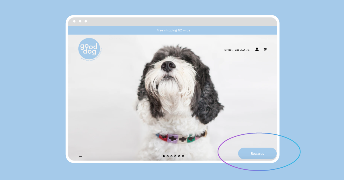
Loyalty programs are one of the best ways to improve retail customer experiences. And the design of your loyalty program matters! To ensure engagement and sign-ups, loyalty program designs need to be simple, eye-catching, and above all show your customers what’s in it for them. From understanding what makes a strong loyalty program, to widget designs that actually convert, this guide will help you design a loyalty program that your customers rave about.
What makes a strong loyalty program?
The best loyalty programs are win-win; you and your customers should both benefit from the exchange.
Improving customer service and experience might actually be making you money. There are a lot of long-term benefits of growing lifetime loyalty and adding extra touchpoints to make sure your customers feel appreciated.
When designing your loyalty program, there are a few key features that will give you a competitive edge:
-
-
- Simplicity for customers - Don’t make them work for it. Using a loyalty program design software like Marsello helps you integrate on-brand widgets and automated marketing campaigns to make it easy for customers to redeem points
- Emotional connection with your brand - You need to create customer buy-in. One way is to give your loyalty program a unique name that builds a community around it. For example, Our Bralette Club uses a play on slang to playfully name their program the Peach Party
- Multiple touchpoints with customers - This includes omnichannel marketing systems like email, SMS, and social media, as well as loyal programs that let customers sign up and redeem points both online and in-store
- Touchpoints outside of transactions - Successful loyalty programs foster interactions with customers that aren’t just transactional. Create a community that is fun, desirable, and invites them in!
-
Want to know more? Check out these examples of great loyalty programs.
Benefits of rewarding your loyal customers
Building retail loyalty is a long-term, sometimes difficult process. So what are the actual benefits of investing in a great loyalty program design? Firstly, it of course builds customer loyalty. 75% of consumers say they favor companies that offer some kind of reward system.
Secondly, loyalty programs increase your revenue. Just one of many examples is size-inclusive lingerie brand Our Bralette Club (OBC). By cultivating positive customer experiences with freebies and discounts in their loyalty program, OBC increased their revenue by 278% through their program members alone.
Next, a good loyalty program design improves customer retention. Loyalty programs give your business an opportunity to improve relationships with customers outside of transactions. Research shows that even a small increase of 5% in retention can boost profits by 25-95%.
Lastly, it helps to create a community around your brand. With community comes customer buy-in, and with emotional buy-in comes referrals. Referral marketing is invaluable for any scaling business, and it starts with customer-centric strategies like loyalty programs.
KPIs to Measure Your Customer Loyalty
It’s not enough to pick a customer loyalty model and wait for it to grow. You need to measure your customer loyalty program over time! How? By measuring the right KPIs and investing in customer relationships long term.
1. Net Promoter Score
A Net Promoter Score (NPS) is a score of how likely a customer is to recommend your brand to a friend or family member. A person with a positive Net Promoter Score (i.,e. they would promote your business to their friends) has a lifetime value of up to 1400% more than someone who wouldn’t promote your business.
Measuring NPS as part of your loyalty program KPIs will give you a fairly good indication of whether customers are engaged and loyal to your brand.
2. Customer Loyalty Index
A customer loyalty index is similar to an NPS score. It takes customer surveys, their purchase history, and their purchase intent for the future to measure their loyalty to your brand.
Tracking loyalty in this way is useful because it combines loyalty with other measurable factors such as retention and churn rate.
3. Repurchase Ratio
A repurchase ratio compares the number of repeat customers to the number of one-off customers. Not only will you identify loyal, returning customers, you will also get an idea of which customers are maybe seasonal for marketing purposes.
In general, 65% of a company’s revenue comes from existing customers. That is why tracking customers who are repurchasing is so important. Not only does repurchasing show loyalty to your brand, it indicates an effective marketing strategy. Revenue up, cost of new acquisitions down!
Examples of great customer loyalty program designs
With loyalty program software like Marsello, you have infinite design options. Whether you want to show off your brand, invite new customers into your community, or increase engagement and retention, Marsello has got you covered.
Check out some of our favorite examples of loyalty program widgets below!
What are loyalty widgets and how can they show off your brand
Widgets are used in place of loyalty explainer pages and are readily available on retailers’ eCommerce stores or through email updates that brick-and-mortar loyalty customers receive. With widgets being a core representation of your loyalty program, we know how important it is that they embody your store’s brand, and to help you customize widgets that really show off your store.
Let’s take a look at each of the available design options within Marsello and how some of our favorite retailers have integrated them into their website and branding.
Center panel
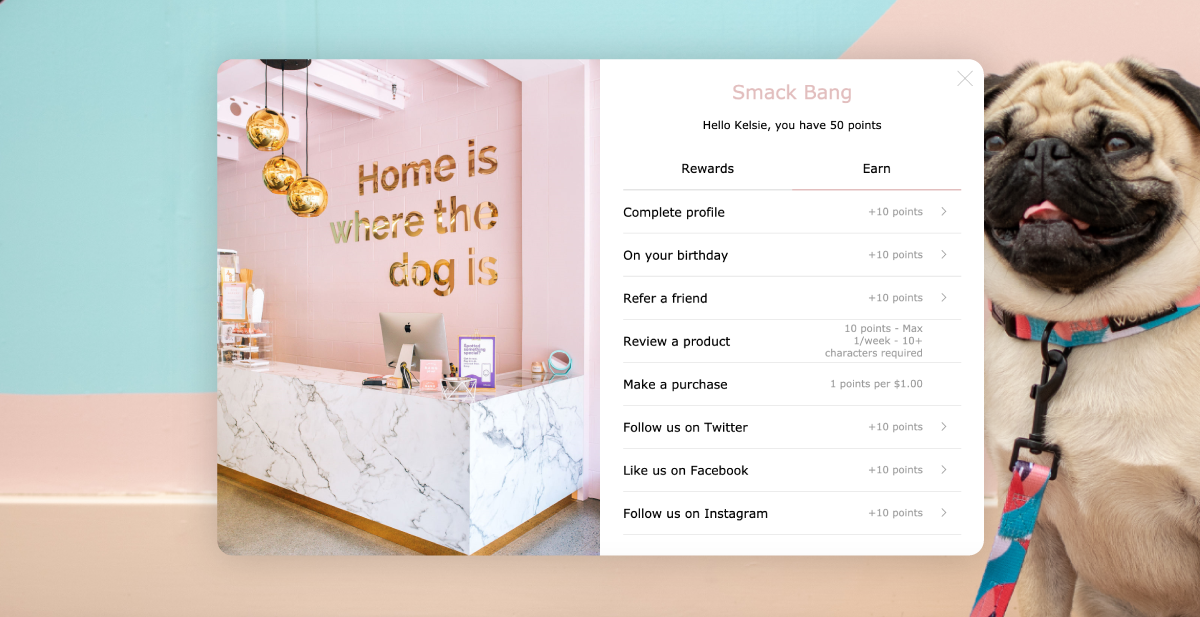
Having your loyalty widget pop up in the center of your screen ensures that it's front-and-center when your customers curiously check out your store’s loyalty options. They can easily navigate through your rewards and how they can earn points, ensuring that they feel informed and that your rewards are easily attainable.
Check out what Wellington-based retailer, Smack Bang, has done with their outstanding designs and generous loyalty program. With offers such as discounts on orders and free shipping, the team at Smack Bang are ensuring that their customers keep coming back to earn points and redeem rewards, while also offering a referral program that ensures they continue to acquire new customers who fit a similar customer profile to their current customers.
Floating Panel
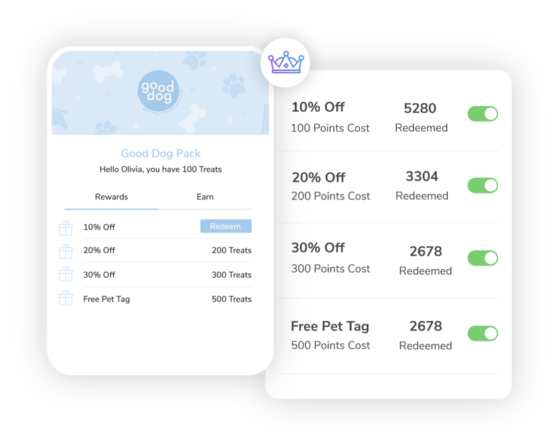
This widget design slides in from the side of the viewer’s screen. With smaller image size options, rounded corners, and a ‘floating’ appearance, this eye-catching display will be sure to inform and entice customers.
We love what Good Dog has done with their widget design, opting for a cute dog-bone print as their primary image and including their store name. With a simple set of percentage discounts as their rewards, Good Dog makes it easy for their customers to earn rewards, and to decide which rewards they’d like to redeem.
Slide Panel
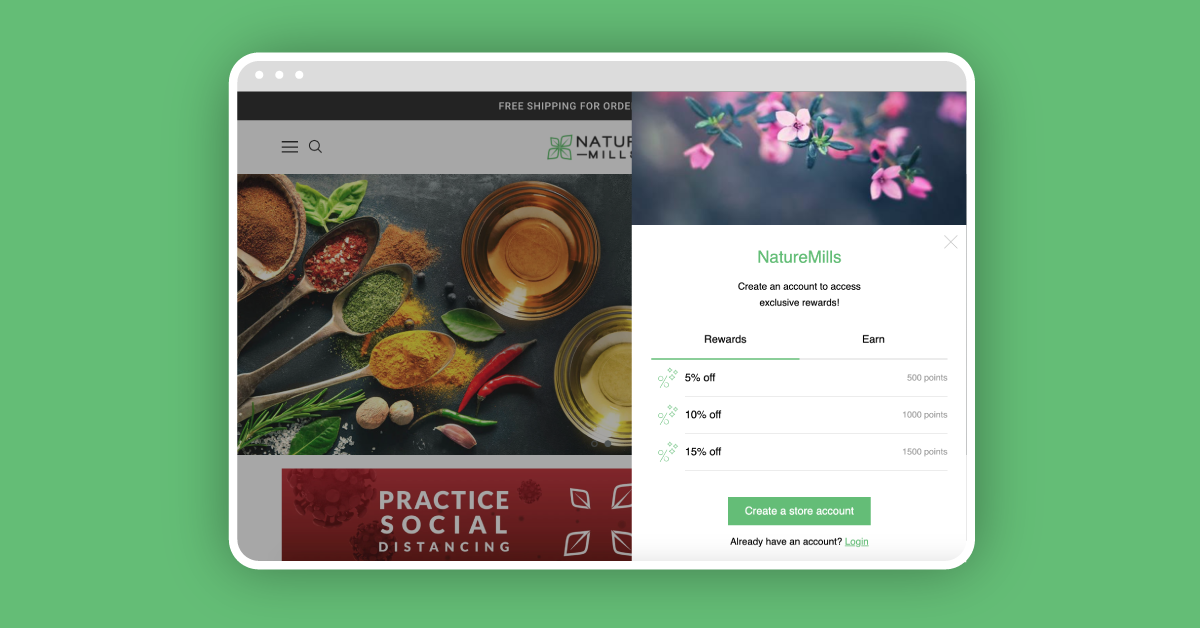
Similar to the floating panel, this crisp design was created with sharp lines, defined corners, and sitting flush against the side of the page of an online store. You’ll notice that the image option for this widget is also small, creating a compact widget that suits fresh, clean branding. NatureMills, a Californian natural and organic food retailer, is a wonderful example of this widget style with clean, on-brand imagery and colors, generous rewards, and simple design choices.
Loyalty tabs to encourage customer interaction
The loyalty tab is also customizable! This great little addition to your store is the initial view that customers have of your loyalty program. It encourages them to explore your loyalty options, shop with you time and time again, and know when they can next redeem a reward or earn points. The tab is like a sign saying, “Welcome, come on in’, to your potential and current loyalty customers.
Let’s take a quick look at the new design types.
Resting
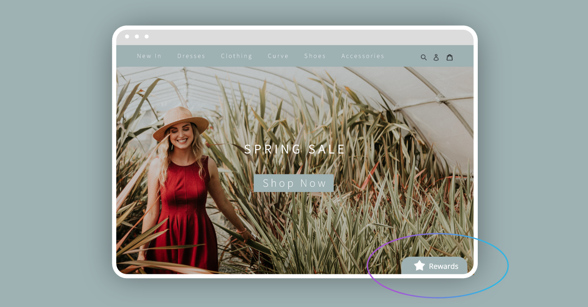
The resting tab is a rectangular shape with rounded upper corners. You can add an icon and/or text to this tab style and design where it will sit on your online store, although its placement is restricted to the edges of the screen, this means that your customer will always be able to see the tab as it’s connected to the edge of your online store.
Circle
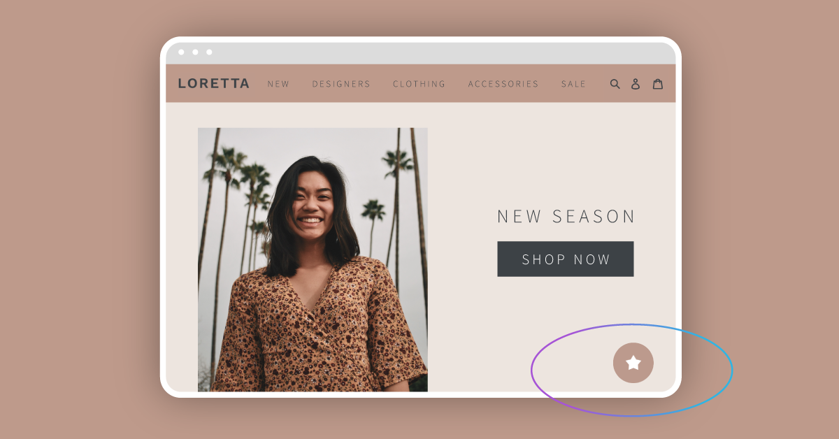
The circular tab is smaller than the other options, designed to be discreet yet eye-catching. It floats on your online store which means that you can place it almost anywhere on your online store and it will ‘float’ down the page as the customer scrolls. Although you can add an icon to this tab, you cannot add text.
Floating
The floating tab design is rectangular and features rounded corners; it’s also ‘floating’. With the ability to add both text and/or icons, this tab is a great way to attract customers to your rewards through a call-to-action such as ‘see our rewards’.
